Friesinger’s Fine Chocolates
Sweatshirt Merch Mock-Ups
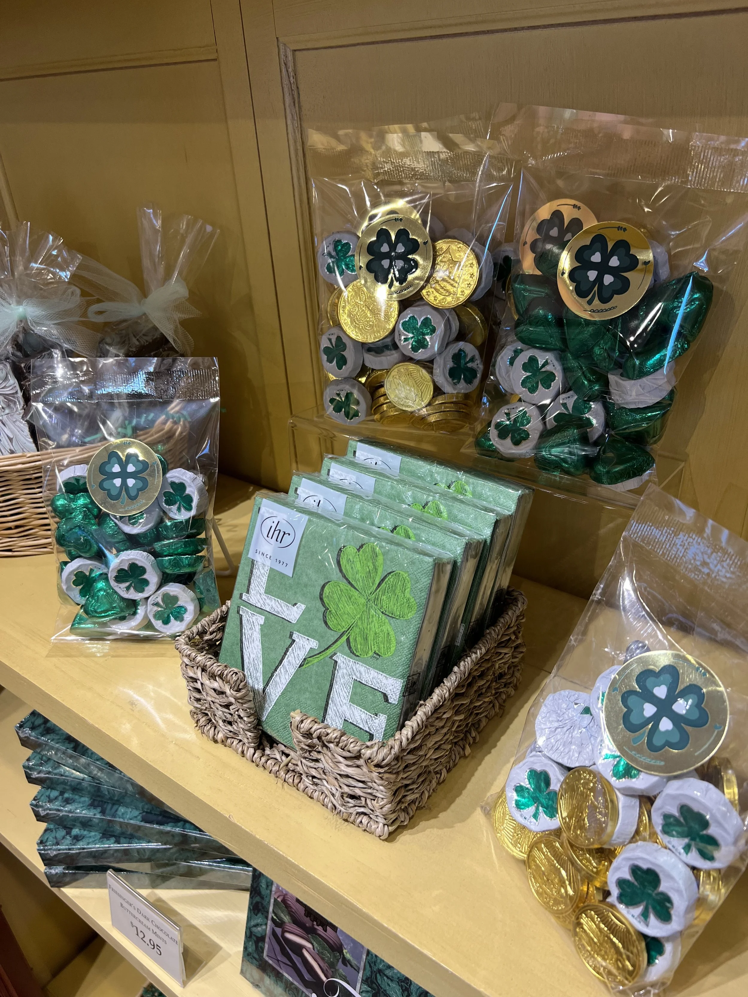
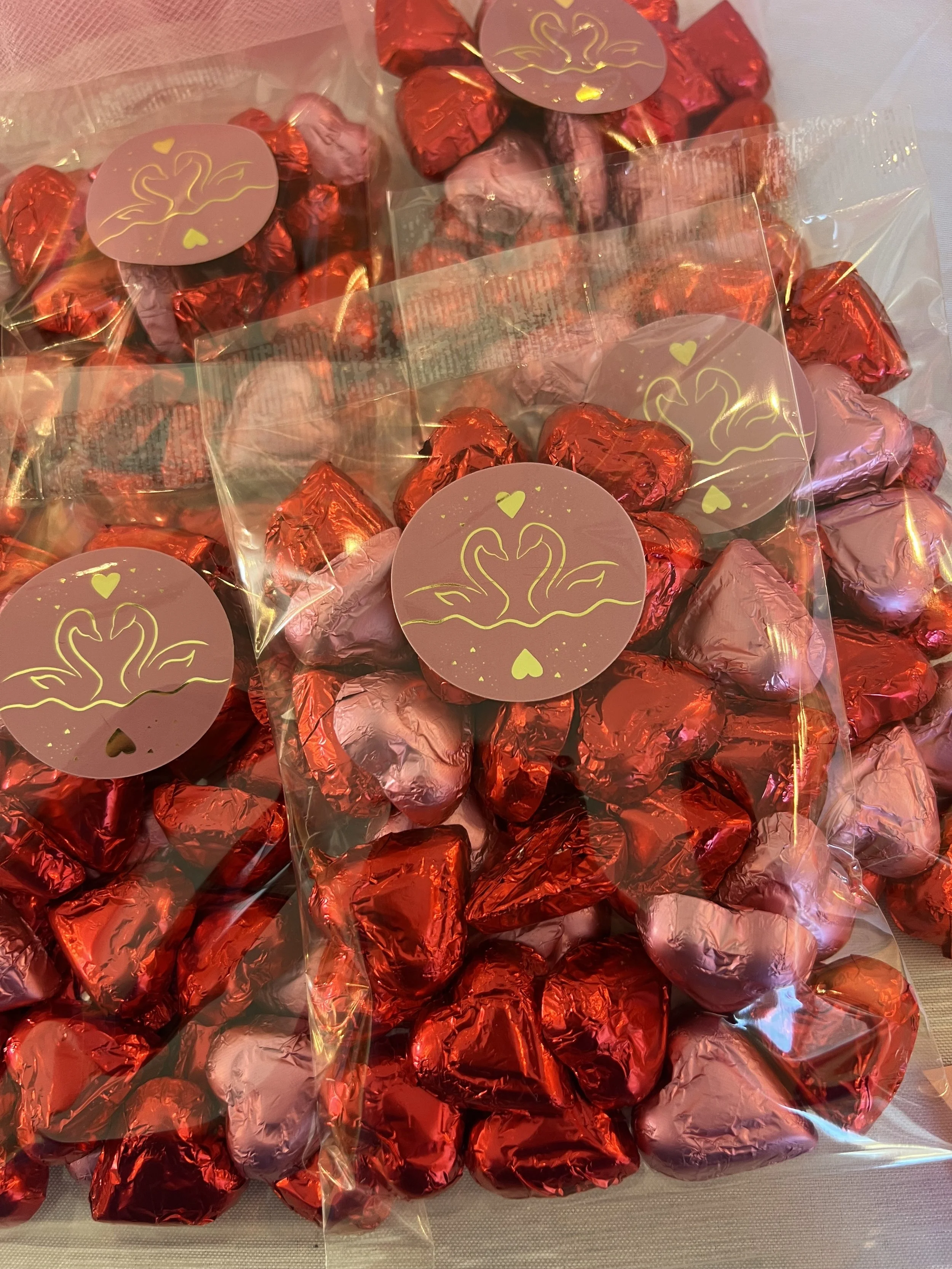
Stickers
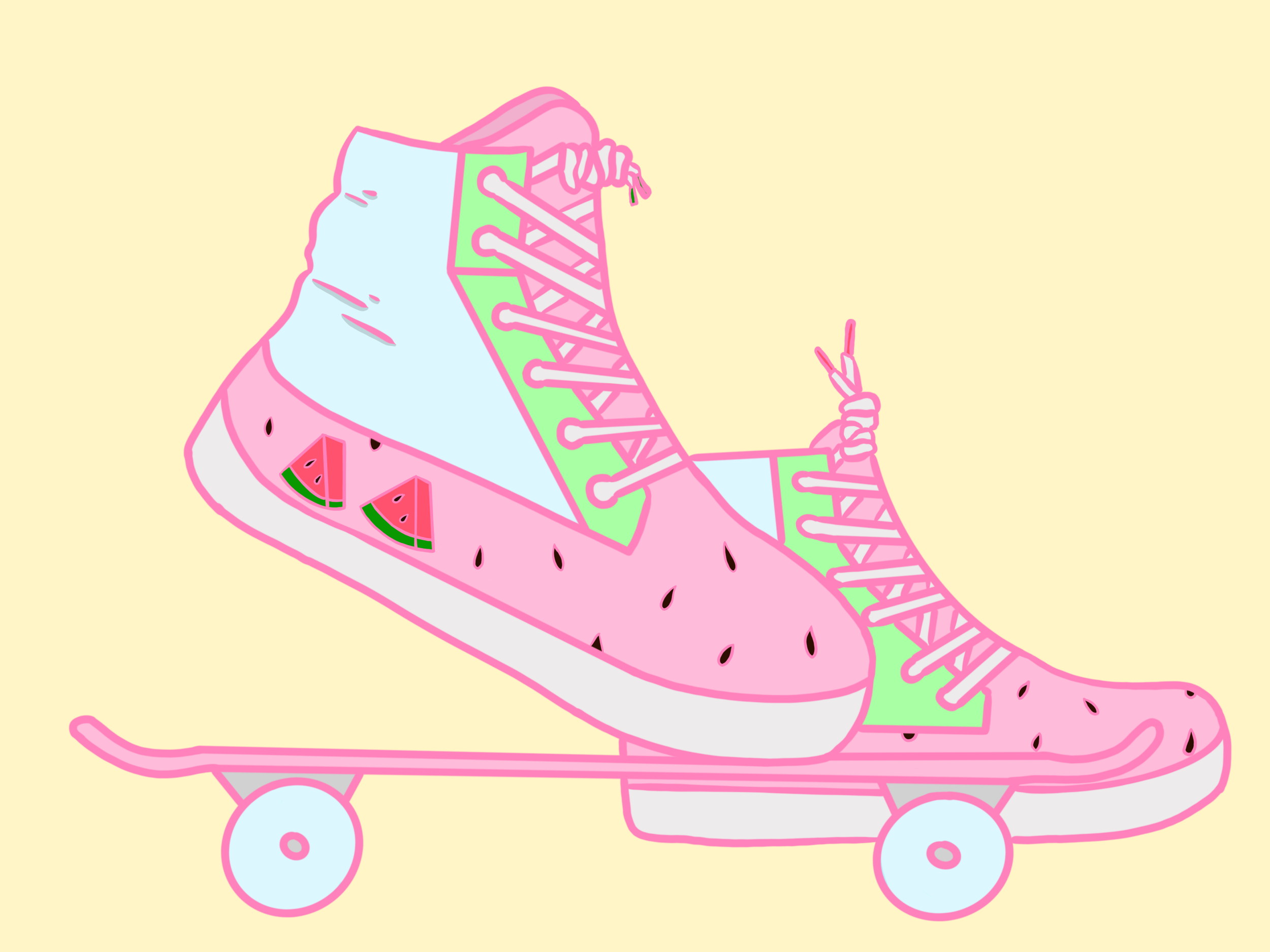
Each sticker was designed for a specific holiday and with the chocolate products in mind to decorate bags and custom packed boxes.
The sweatshirts were designed to highlight and promote the Neapolitan Coconut Bar, which was very successful in distribution but needed a little more love in the storefront.
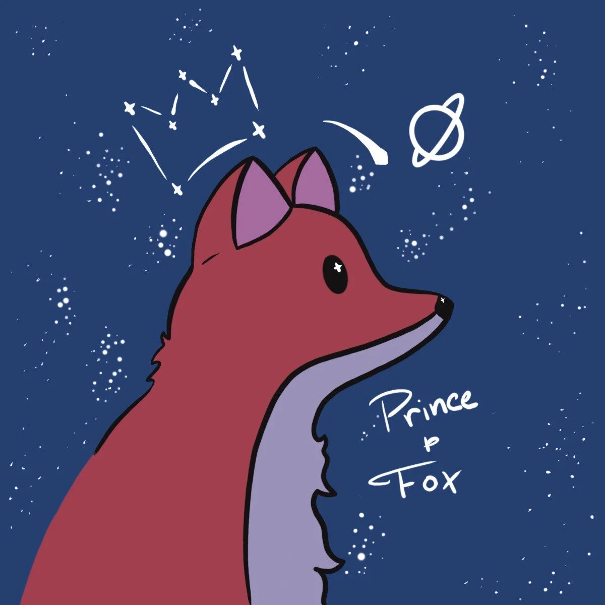
Prince & Fox Music
Business Card
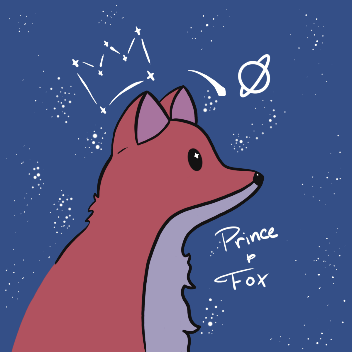
As a start-up, there was a lot of room for exploring the brand and aesthetic. We decided on referencing the name of the company to keep a sense of identity among products that feature idols groups who feature their own brands and aesthetics.
Promotional
Stickers
Mid High
Market
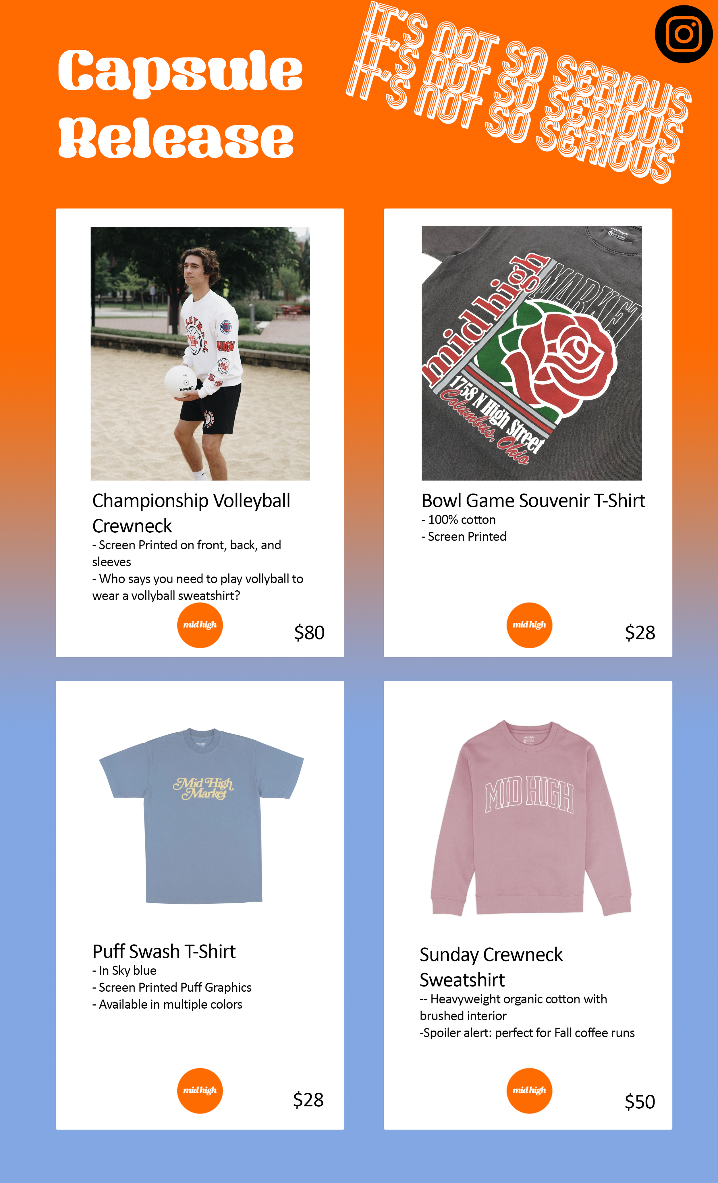
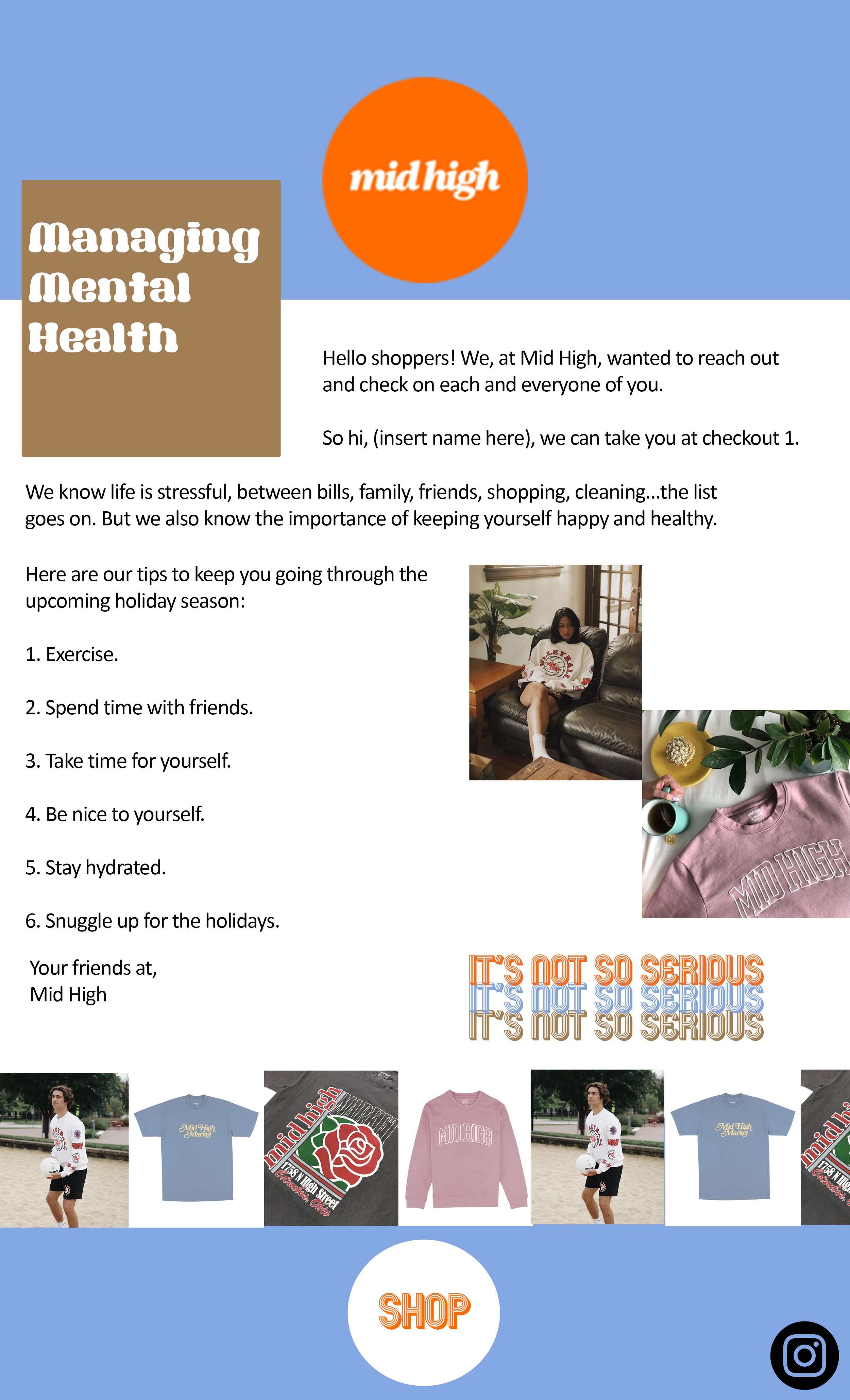
Working with Mid High Market, our team focused on reconnecting with their brand aesthetic that wasn’t being translated to the customer. My piece of the project was designing a stamp/sticker and an email template with some sample writing.
Process:
I put together a 60s/70s color palette, starting with the orange of the logo. With those colors in mind and on the lookout for time period themed fonts, I made a stamp of something the owner had said in one of our interviews when describing what he wanted to say with his brand.
Then for the emails I stuck with a fairly simple design that was eye-catching and would be instantly recognizable, while also allowing the viewer to focus on the writing.
Async Learning
Logo Options
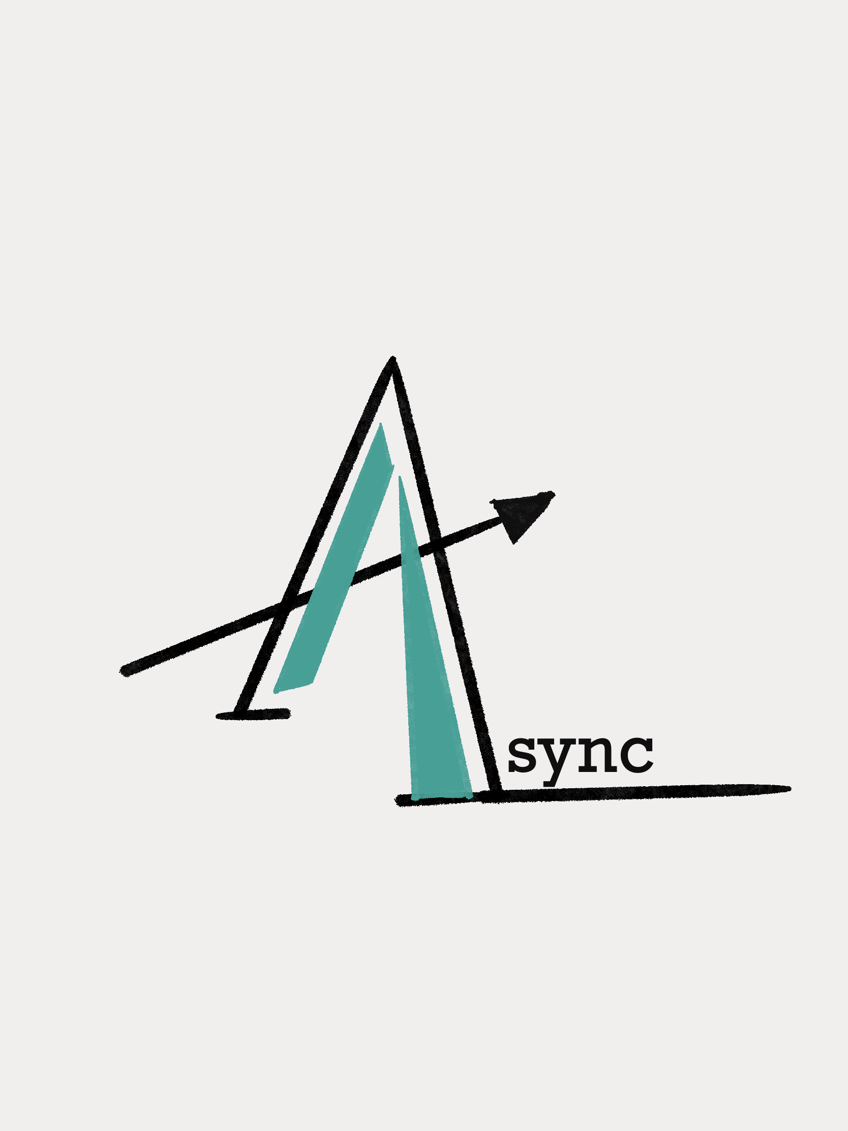
I worked with Async Learning before it launched and was tasked with giving more ideas for logos. Compared with the idea they originally were working with, we moved into a simpler style to avoid clichés the former was running into.
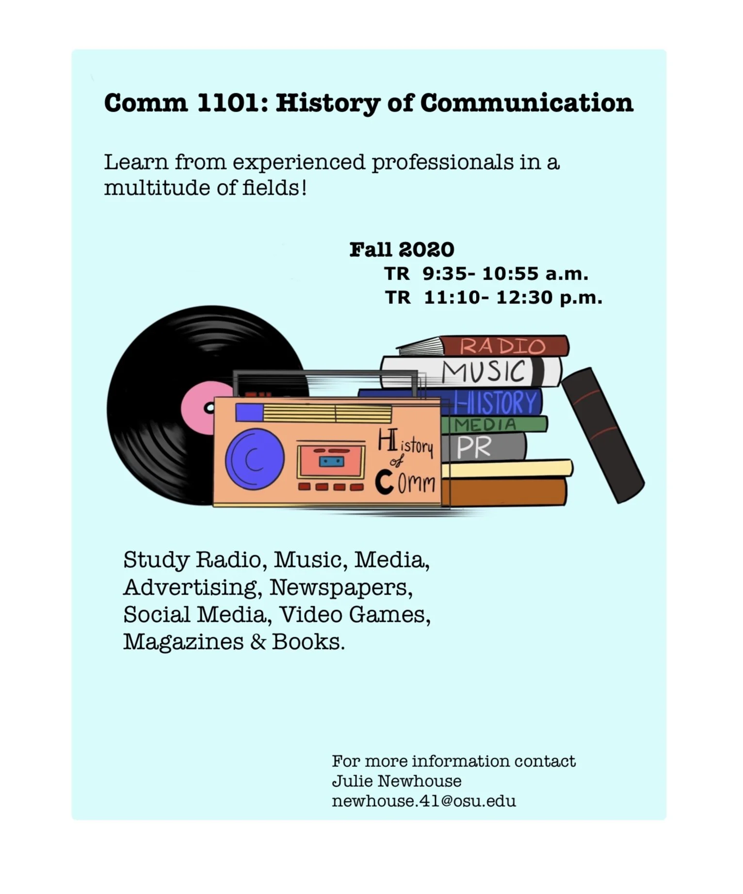
Flyer
As students or recent grads, the founders of Async Learning wanted to gain talent from their college. This design aimed to attract the eye in dorms and bulletin boards, and to make it as easy as possible for them to seek out information.
Thumbs Up Construction
Christmas Card
Custom card with the logo integrated into the design.
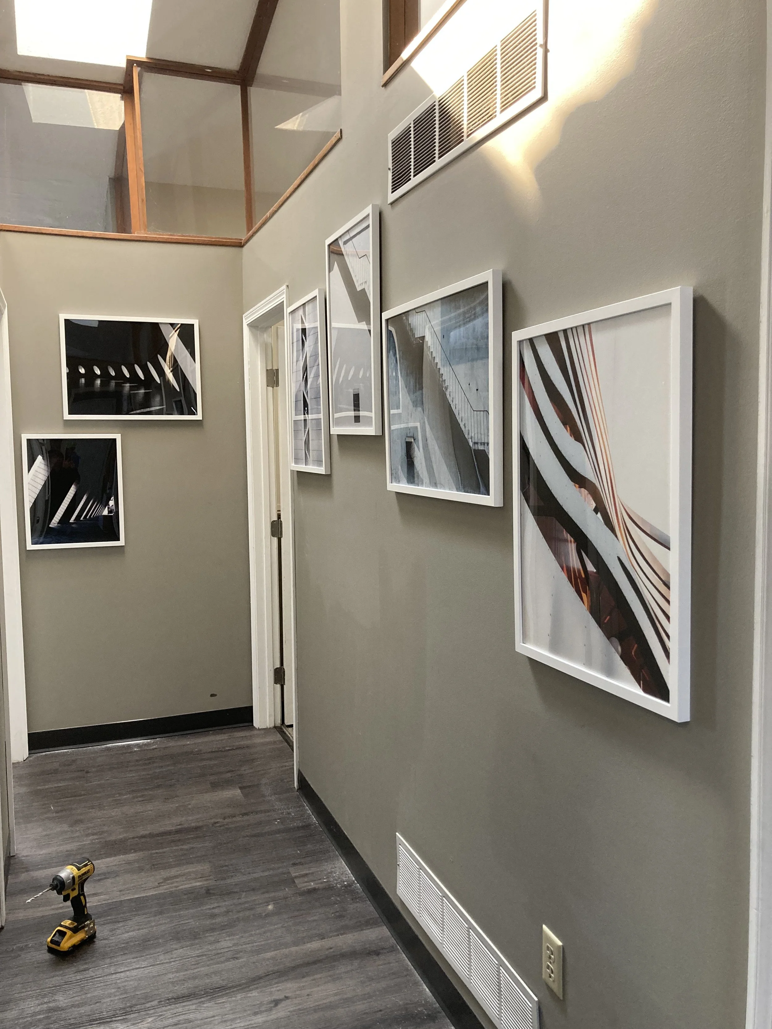
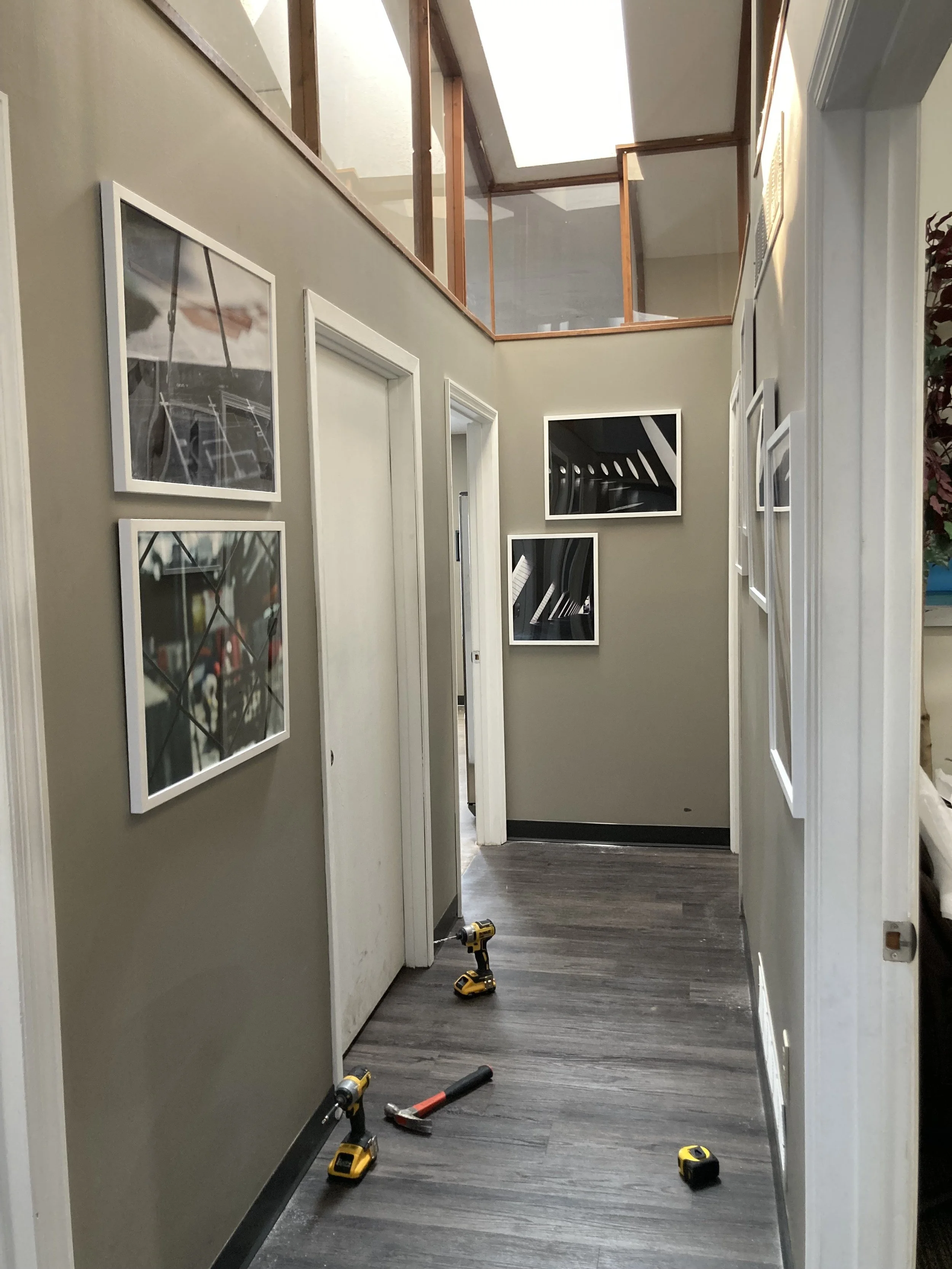
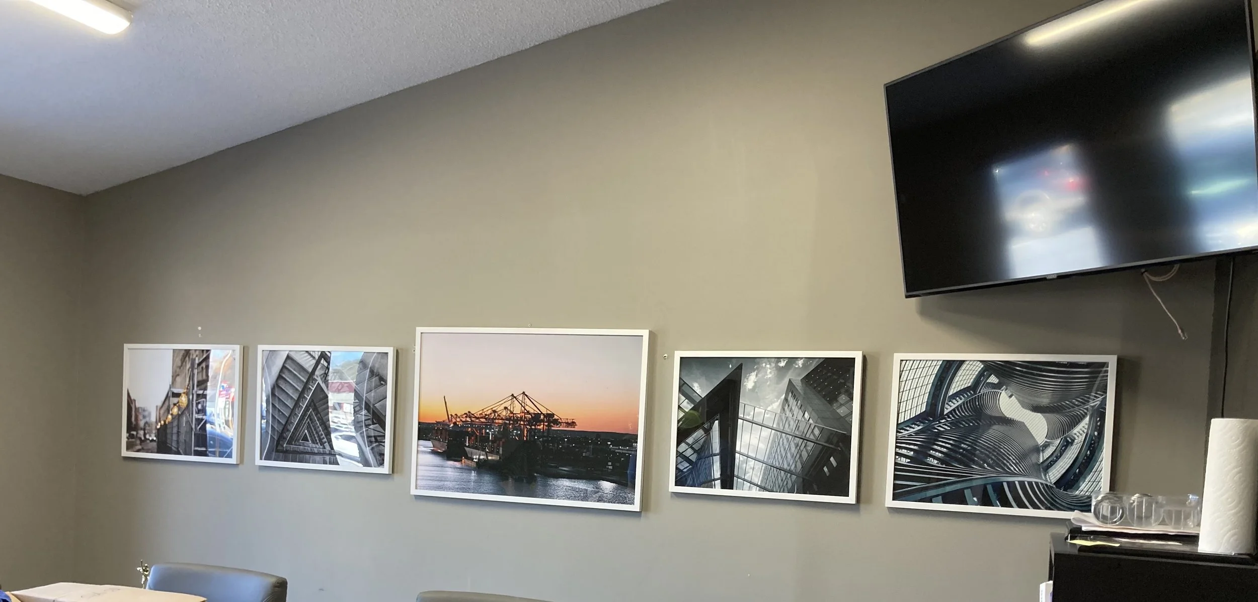
Office Redesign: I wasn’t given a strong direction for this project so I used series of mood boards and mock-ups to see what the owner was interested in seeing in this visual update. These were the winners.
While getting the photos printed we had to make adjustments to the plan, but the proportions remained the same.

